Being a recent transplant to the United States, I am no stranger to the conceptions and misconceptions about Asia/Chinese culture. A visit to a souvenir shop in Chinatown showcases the many things that fall under the “vaguely Asian” category – fabric fans; fake bamboo carts; elephants as toy; elephants as god; cats, and not just Hello Kitty; scroll painting; ninjas, and so on.
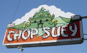
Along with the junk and trinkets are some American Chinese design that even non-Americans are familiar with – the angular type that makes an attempt at mimicking Chinese calligraphy brushstrokes, or what Jennifer 8. Lee calls, the Chop Suey font.
Design historian and School of Visual Arts professor, Paul Shaw, whose 2009 article for PRINT magazine offers a comprehensive look into the history of quasi-ethnic fonts, noted that Chop Suey (or Chopstick) letting dates back to the mid-19th century, at a time when the Chinese first started immigrating to the US in large numbers.
The one 19th century face with an unmistakably Asian name and a suggestive appearance is Chinese (Cleveland Type Foundry, 1883). Known since the mid-50s as Mandarin, the face is characterised by curved and pointed wedge strokes that superficially resemble two of the eight basic strokes of Chinese calligraphy: the downward left stroke and the upward right stroke. Unfortunately, the strokes, forced onto the armature of Roman letters, are assembled in a manner that completely ignores a calligraphic emphasis on structural balance and harmony.
Mandarin is the granddaddy of what have come to be known as Chop Suey types. It’s a fitting name, just as chop suet is an American invention, so, too, are the letters of Mandarin and its many offspring. Neither the food nor the fonts bear any real relation to true Chinese cuisine or calligraphy. But this has not prevented the proliferation of chop suey lettering and its close identification with Chinese culture outside of China. Mandarin was used by the Beggarstaff Brothers (William Nicholson and James Pryde) for their 1899 poster, “Trip to Chinatown”. The poster was included in Les Maîtres de l’Affiche, the enormously influential money publication showcasing the most beautiful posters of the fin de siècle. By the end of World War I, chop suey lettering had become synonymous with San Francisco’s Chinatown. This may have been due to the influence of the Beggarstaff poster, or it could have been a way to distinguish the rebuilding of Chinatown as a tourist destination following the 1906 earthquake. The new Chinatown was flamboyantly, theatrically Chinese, complete with pagoda roofs and other exaggerated and stylised details.
It is ugly, if not racist, but enterprising Chinese-American restauranteurs are the ones who most eagerly embraced the chop suey lettering. It was obvious about what it hinted at, and after 1.5 centuries, it has cache.
Given the unpleasant associations of the typeface, why did so many Asian eateries end up adopting it? “In many places it’s become a signaling device,” he says. “Fail to use this kind of lettering and you run the risk of being overlooked. If your sign is something really nice in Helvetica, people might go, ‘Is that really a Chinese restaurant?’ So there’s a commercial incentive for takeout places to use this typeface. And not just Chinese restaurants — I’ve seen Japanese, Korean, even Indian restaurants use this style of type, which of course makes absolutely no sense.”
(via WSJ)
“Ethnic” typefaces are not restricted to chop suey lettering – Greek and Mexican and Jewish outlets employ the same schtick, not because of a malicious intent to play up stereotypes, but simply because these fonts are good at what they do: distill an entire culture into a typographical aesthetic that becomes a signifier to the uninitiated.
Still, where does one draw the line? More importantly, we should note that these fonts are often employed by the immigrants themselves. As Shaw puts it, as long as there is chop suey, there will be chop suey lettering.

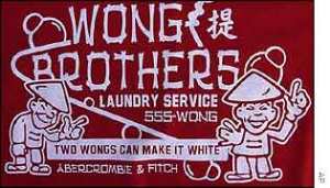
Two Wongs can make it white. Also, 80% of manicurists in California are Vietnamese Americans; Cambodian Americans own approximately 80% of doughnut shops in LA; Koreans own 65% of the dry cleaners in NYC. (T-shirt from A&F, data from a book called Contagious, by Jonah Berger)


